Content Strategy
Voice& Tone
We created a "this but not that" list (by Kate Keifer Lee) to describe its personality.
Compassionate but not sentimental
Inclusive but not exclusive
Action-oriented but not aggressive
Approachable but not unprofessional
Engaging but not overwhelming
Competitive Analysis
What we learnt from our competitors.....
User Journey
By following budget-conscious foodie Alex's journey, I tried to outline any pain points that the user is likely to face for each phase.

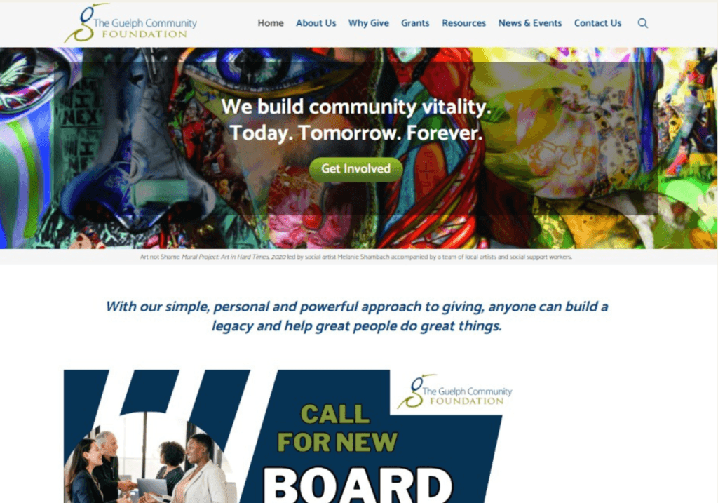
Using Images and Videos: We've seen how well our counterparts employ this unique skill or feature, and this has helped us get important insights into how we can sharpen our own strategy.
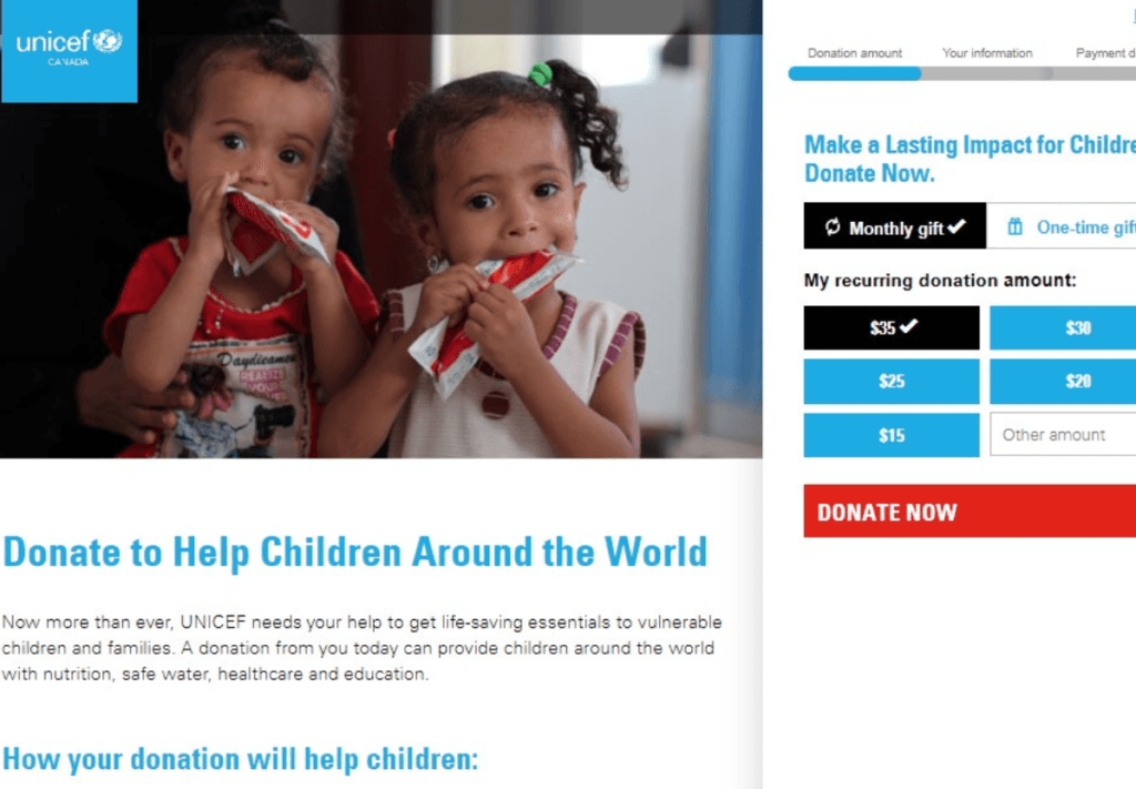
Showing Impact of Donations: The UNICEF website sets an excellent example for others to follow by clearly and transparently outlining the impact of donations.
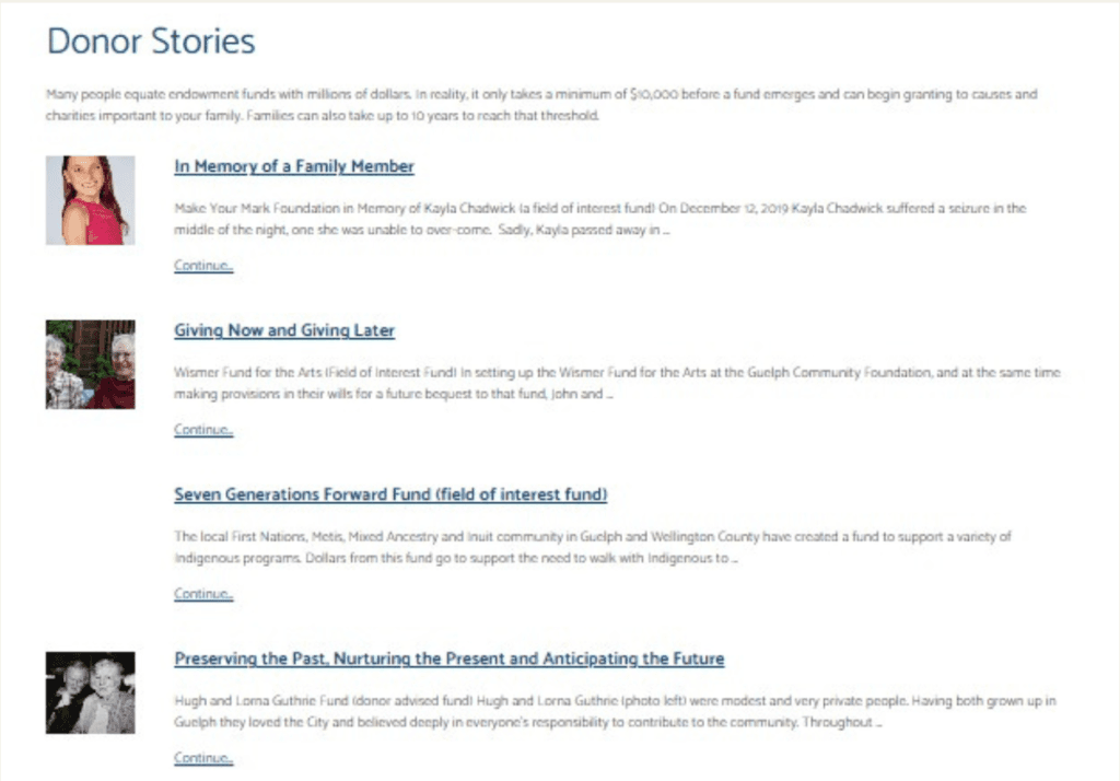
Testimonials: On a website, testimonials may be a powerful tool for building visitors' confidence and trustworthiness. Testimonials offer social evidence and can prove the beneficial effects of a company's work by highlighting the opinions and experiences of pleased customers or recipients.
EWCS
(East Wellington Community Services)
In the heart of the Erin neighborhood, EWCS plays a vital role in providing essential support to individuals in need. Our committed team was passionately working to breathe new life into their online presence, infusing innovative strategies into the very core of their website.
Project: Team Project at Centennial College
Client: East Wellington Community Services
Sector: NGO
Duration: January. 2023- April. 2023 (4 months)

The Process
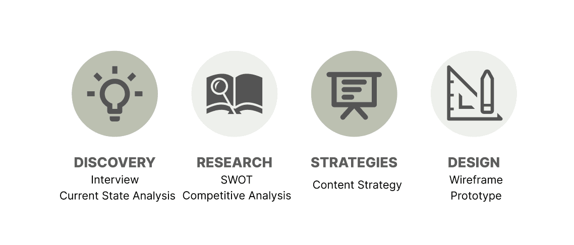
Interview
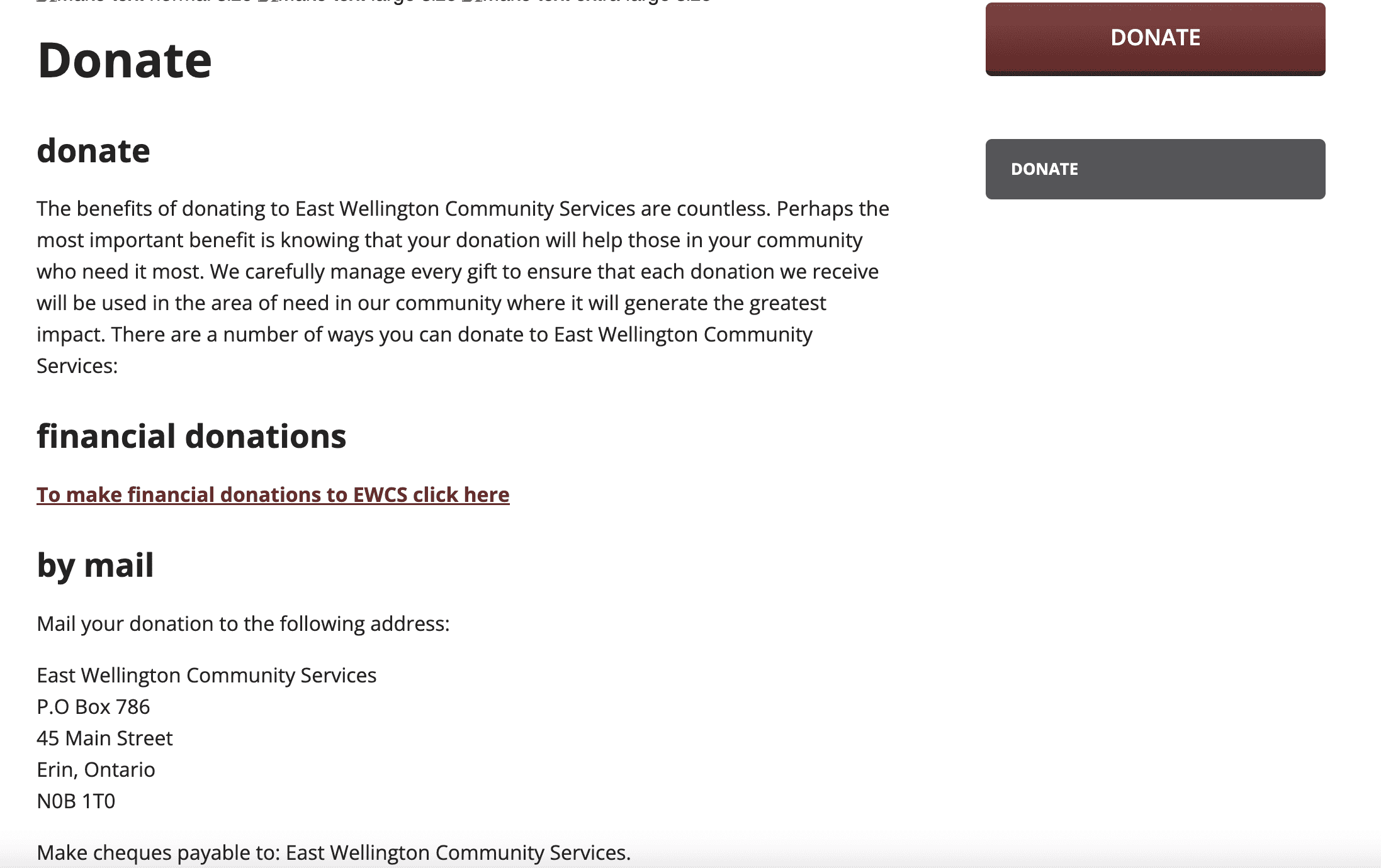
At first, we conducted interviews with EWCS in order to get a better understanding of the problem. The findings from their webpage highlight two key challenges.
There are difficulties uploading and editing webpages due to the limited staff.
Considering that most of the website's visitors are seniors, it is imperative that the design is easy to read.
Findings from Current State Analysis
Lack of information- There isn’t enough information about the EWCS’s work on the homepage to build the level of empathy that would motivate the users to donate.
Lack of interactivity- The user experience on the website is currently static and lacks interactivity.
Lack of visual stimulation- The lack of visually interesting content on the website makes it less appealing and less likely to grab users' attention.
The lack of clarity on the purpose and suggested donation amounts - The donation page of EWCS doesn’t answer why one should donate or how much one should donate, which may decrease the likelihood of a donation.
Discovery
Situation Overview
In the heart of East Wellington(https://eastwellingtoncommunityservices.com/), our community center serves as a symbol of positive change. With deep roots in our vibrant neighborhood, the East Wellington Community Center is more than just a physical space; it's a hub of connection and growth.
However, a stagnant website has limited the reach and resonance of their impactful work. Our dedicated team is on a mission to revitalize their online presence, weaving creative techniques into the fabric of their website.
The goal is to evoke empathy, build trust, and inspire a wave of support to encourage more people to support EWCS.
Research
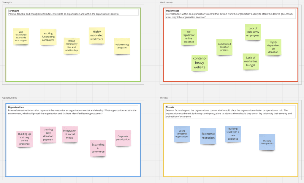
SWOT
Strategy
Visual Enhancement
In order to make each service area more engaging, we chose to include more visuals and stories that impact the viewer. This will immediately inform visitors about the scope of their work.
By adhering to the "Make it simple" strategy, you can create a website that is inclusive, user-friendly, and welcoming to seniors, donors, volunteers, and individuals seeking help, ensuring that they can easily access the information and services they need without encountering unnecessary complexity or barriers.
Make it simple
Design
Personas
We have created three distinct user personas, which include donors, volunteers, and individuals seeking assistance.

Visual enhancement
Initial Concept

Final Presentation
Our team delivered the final presentation to EWCS on April 19, 2023, at the Centennial College campus. If you'd like to view the presentation file, please click here.
Takeaways
Some key takeaways from this project are:
Inclusivity: Ensured the website is accessible to all, emphasizing a commitment to inclusivity and making community resources available to a wider audience. Carefully choose visual elements with a warm colour palette and compelling imagery, reflecting the welcoming and vibrant spirit of the center.
Community Impact: Witnessed increased engagement, participation, and inquiries from residents, resulting in a more connected and informed community.
Empowering the Community: Implemented an intuitive content management system, allowing center staff to easily update and manage website content without technical expertise.
Final solutions
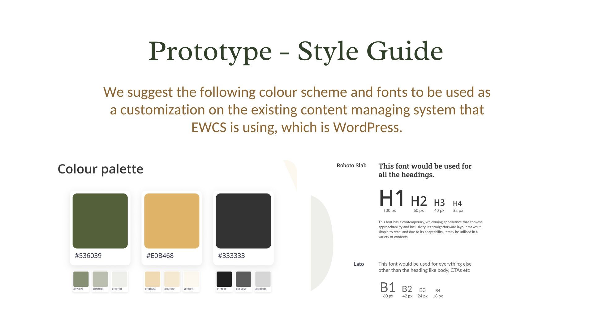
Given the shortage of tech-savvy employees, we recommend considering WordPress as the existing content management system. WordPress is renowned for its user-friendly interface, making it accessible for staff with varying technical expertise levels. This choice can streamline content management tasks and facilitate efficient updates to the website.
Before
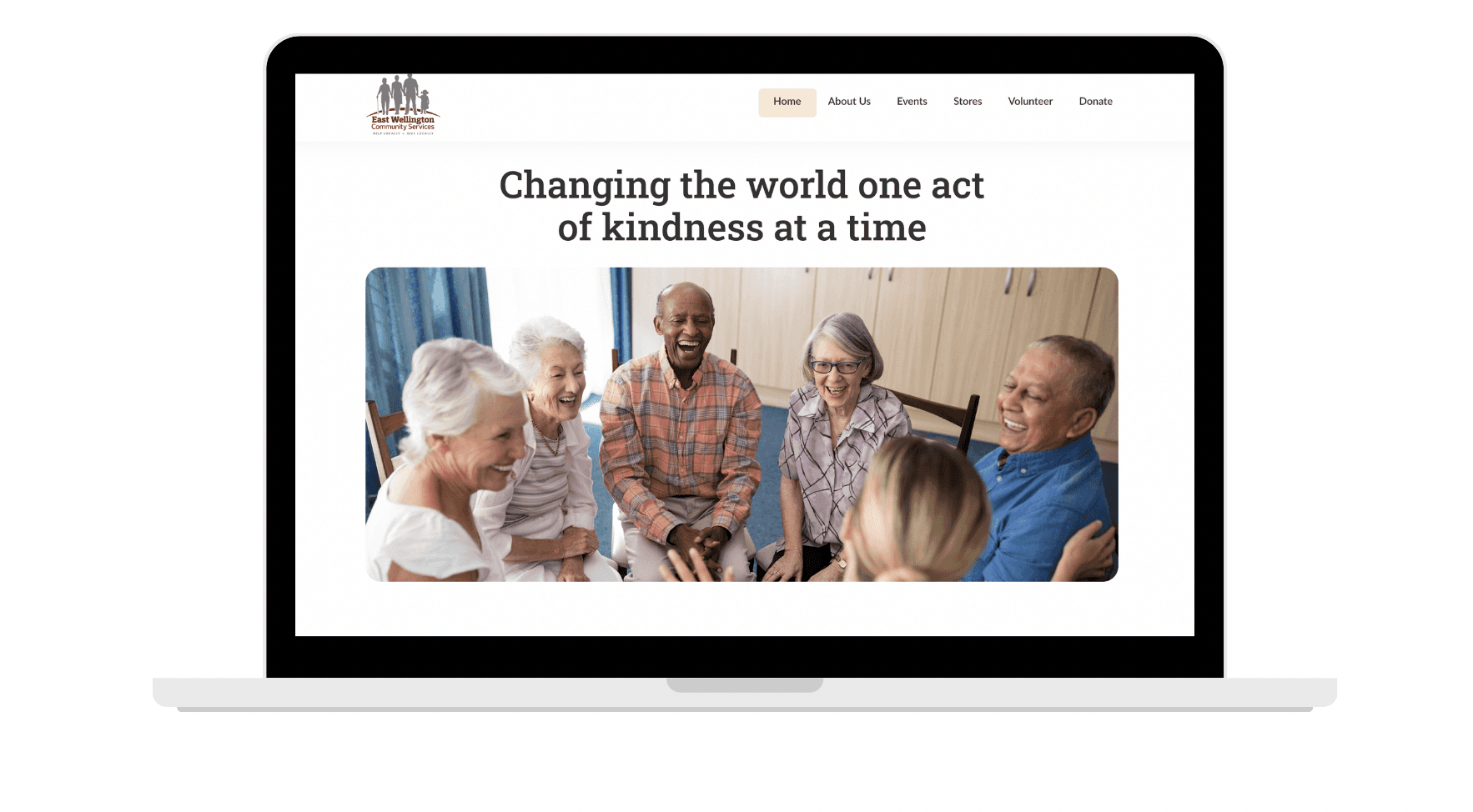
Improved the clarity of what they are doing by adding more visuals
After
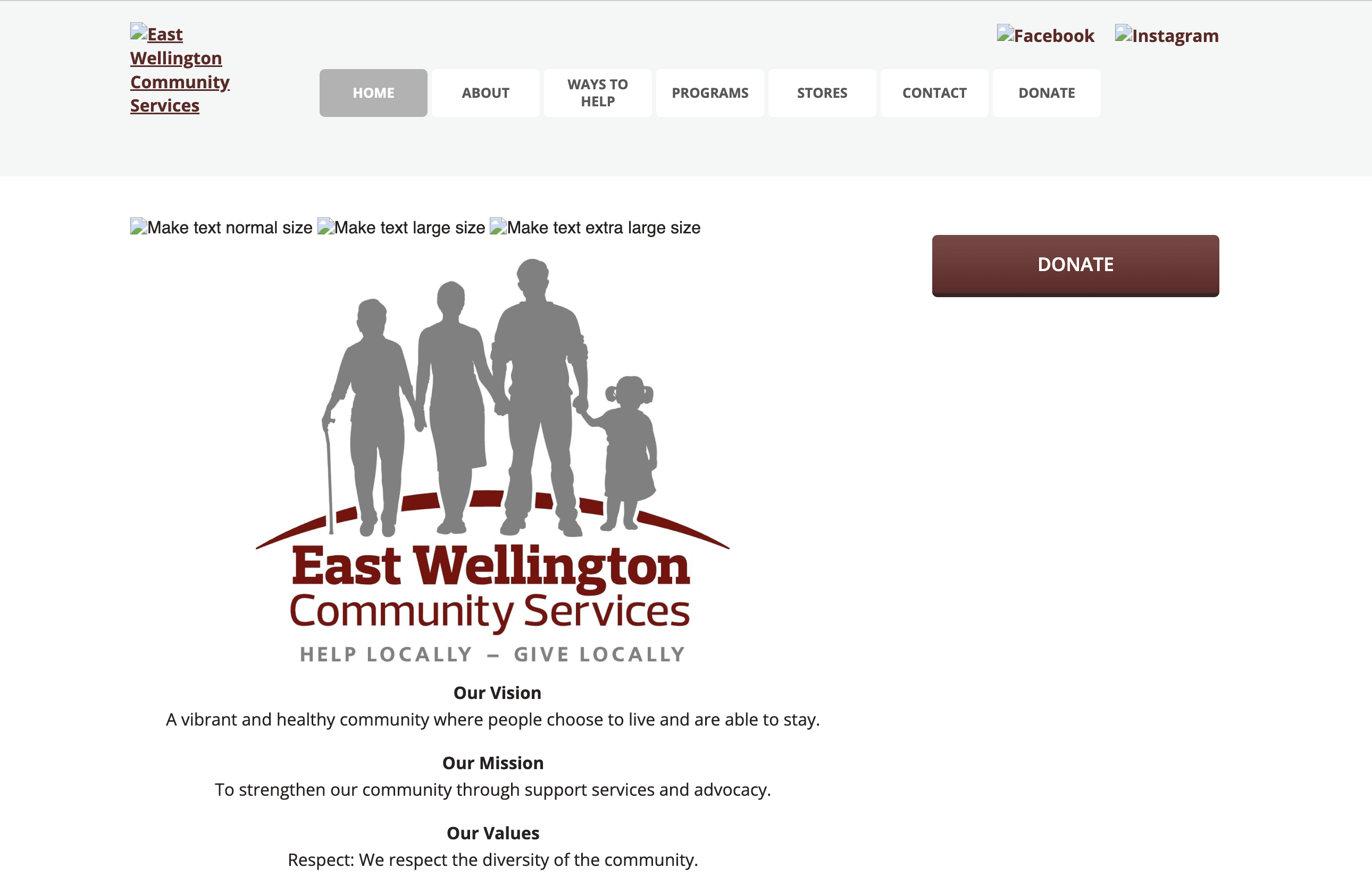
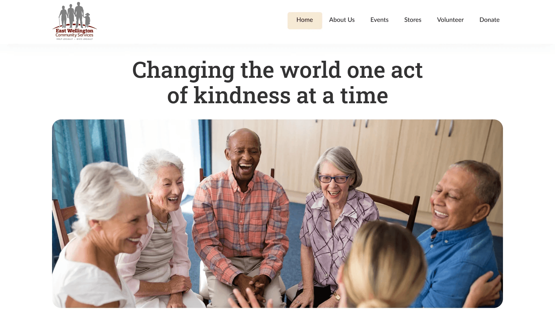
Home Page
Before
Instead of listing names, added photos of board members to create a more human connection.
After


About
Before
Added more interative elements to show the impact of donation.
After
